
To Advertise on Instagram Is Cheap For Your Business In Nigeria
August 14, 2020
Facebook Name Change and Metaverse Rumors Surface. All We Know For Now.
October 21, 2021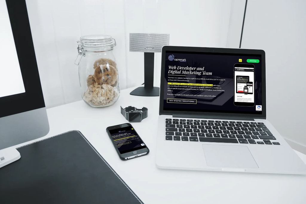
What Is a Mobile-friendly Website?
A mobile-friendly website or a responsive website simply means that the information (images, texts, videos, links) displayed on your website can be perfectly viewed across different devices, screens, platforms, and most importantly, on smaller screens such as smartphones, tablets, and even the modern smartwatches.
With a mobile-friendly website, you are rest assured that information displayed on your website is modified to fit every user’s mobile device (tablet, iPad, or smartphone) and also easy to navigate without the user needing to increase the size of displayed materials via zooming in or adjust their settings manually.
All information displayed on a responsive website must be created with the user in mind for easy accessibility, irrespective of the users’ device.
Mobile-friendly websites have become very popular over the years because mobile phones are now extremely smart (advanced) and they have now become part of our daily lives. Most people now have access to a mobile phone and use a mobile phone on the move.
Therefore, it is only sensible to have your website information displayed in a mobile-friendly mode.
According to information provided on statistica.com, mobile devices account for approximately half of the web traffic worldwide. In the third quarter of 2020, mobile devices (excluding tablets) generated 50.81 percent of global website traffic, consistently hovering around the 50 percent mark since the beginning of 2017.
Example of Our Website’s Homepage Display On A Desktop
Example of Our Website’s Homepage Display On A Tablet

Example of Our Website Homepage Display On A Mobile Phone

Due to the availability of smartphones everywhere, most businesses are now turning to mobile-friendly (responsive) websites and mobile web development to ensure that their website is optimized for smartphone display and effective user experience.
Difference Between A Mobile-friendly Website (Responsive Website) And A Mobile Website?
While a mobile-friendly website and a mobile website are both optimized for a maximum mobile experience, they are not the same thing.
As explained above, a mobile-friendly website which can also be called a responsive website is created with the users’ experience in mind. Website materials are enhanced for visitors to easily access information on all devices.
A mobile website takes things a step further. A mobile website is created specifically for mobile devices and usability only. This means that if you have a mobile website, you will have to manage both your main business website and your mobile website separately.
For a responsive website, you will not need to manage different website materials and files because your website will be designed to respond to the exact needs of the user and the device they are using to access your website from only one place.
A responsive website design allows the displayed graphics on your screen to stretch from one edge to the other, irrespective of the device’s dimensions or size.
4 Advantages of A Mobile-Friendly Website
- Enhanced User Experience: With your website now mobile-friendly, you will no longer be worried that only those visitors with specific devices can access your website. Smartphone users from every location will be able to access your website. With this, you can immediately engage users with mobile-specific features such as click-to-call, mapping functions. Hence increase in traffic and enhanced user experience.
- Enhanced SEO Performance: Search engine result pages rank websites that load faster. This will result in more visitors returning to your site and also improve the overall user experience of those who come to your website, so you can start converting visitors into customers.
- Competitive Presence: Having a mobile-friendly website is a sign that you are in tune with trending industry standards and ready for business. Smartphone users will not overlook your business for the competition and you will now be able to secure your market share from the industry.
- Affordable Maintenance Cost: A responsive website is only managed from one place and displays information to all available devices. This indicates that you will not need to create a separate mobile website for your business
Your mobile-friendly website will serve data to every device automatically.
Conclusion
The investment of having a mobile-friendly website will save you time and money in the long run and also improve your business massively.
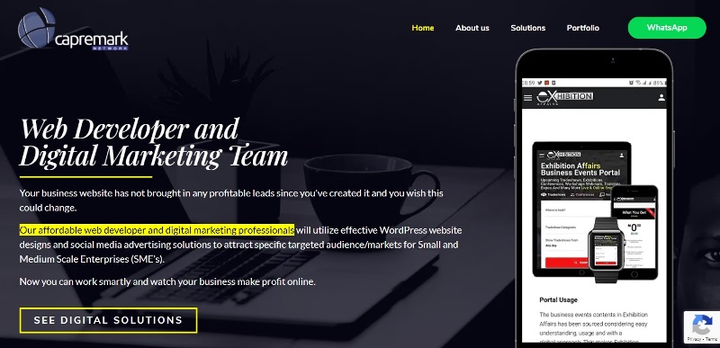
At Capremark Network, we will help you develop an affordable website that is mobile responsive, SEO friendly, and secure. This will allow your online audience to clearly and securely view your webpages on all devices.
FAQ’s About Affordable Mobile-friendly Website
-
What Is a Mobile-friendly Website?
A mobile-friendly website or a responsive website simply means that the information (images, texts, videos, links) displayed on your website can be perfectly viewed across different devices, screens, platforms, and most importantly, on smaller screens such as smartphones, tablets, and even the modern smartwatches.
-
What Is The Difference Between A Mobile-friendly Website And A Mobile Website?
With a mobile-friendly (responsive) website, you will not need to manage different website materials and files because your website will be designed to respond to the exact needs of the user and the device they are using to access your website from only one place.
While a mobile website is created specifically for mobile devices alone. This means that if you have a mobile website, you will have to manage both your main business website and your mobile website separately. -
Is It Necessary To Have A Mobile Website?
Yes, it is very necessary for your business website to be mobile friendly in today’s business world. It will help you reach a wider target audience, rank higher on search engines, make more sales, and look professional.
-
Can I Find An Affordable Website Designer In Nigeria?
Yes. Capremark Network can help you design a very affordable and responsive website for your business.
Contact us via phone calls or WhatsApp on +234-8092691279